Saturday, June 26, 2010
Friday, June 25, 2010
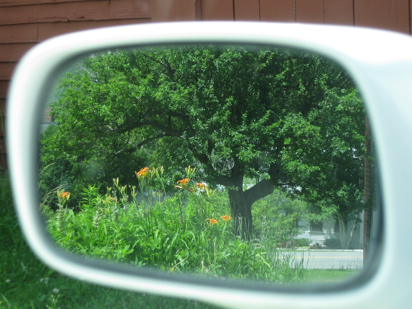
Balance
For this week's research assignment I looked into balance and how it affects the composition of a photo. A well-balanced photo seems much more pleasing to the eye. When a photo is balanced it means that there is an good distribution of people, colors, and shapes so that the entire shot feels balanced. For example there aren't large amounts of people on one side of the photo with only one person on the other. If there is a bright color in one corner of the shot, bright color in the opposite corner would balance it out. This doesn't mean that a photo has to be perfectly symmetrical though -- it just shouldn't have all your attention drawn to one small space with nothing to look at in the rest of the frame.
The link I used is listed below. It had some great photo examples. I would check it out if you are interested in seeing more of what balanced means in photography!
http://photoinf.com/General/KODAK/guidelines_for_better_photographic_composition_balance.html
The link I used is listed below. It had some great photo examples. I would check it out if you are interested in seeing more of what balanced means in photography!
http://photoinf.com/General/KODAK/guidelines_for_better_photographic_composition_balance.html


Thursday, June 24, 2010
Rule of Thirds

 These were my two shots comparing a "bull's eye" photo with one using the rule of thirds technique. I use the rule of thirds often because I had learned it in an art class I took a while ago. I think that sometimes a photo looks better when the subject is smack dab in the middle, but often is looks better a little off-centered. I especially like the rule of thirds shot out of these two because of the one stem that strays off from the rest of the daisies. I find that it pulls your eye away from the bouquet, like we learned that leading lines can do in our reading this week.
Tuesday, June 15, 2010
Colors
 This first photo was my analogous color shot. It was a number of blue vases next to each other with the sky out the window behind them.
 This second shot is my complementary color one. I find this one a lot more pleasing to the eye which I was surprised by. I especially like how there is just a small bit of red on the ends of the berries as well.
Different lighting


 I took the third picture shown here first while I was just experimenting with long exposure and night shots but I really liked it so I decided to take a couple others of the same view for this assignment. It's the view out of one of the upstairs windows in my house. The first picture is pretty plain but I like how you start to see some color in the sky in the second shot, and then I loved the headlights from the car illuminating the trees in the third.
I don't think that if I hadn't taken the night shot first that I would have picked this scene to shoot for this assignment. I was just so surprised at how much I liked the night shot that I had to use it. I was actually trying to get a shot of the stars when I took it but the car came along which I think made it so much better.
The evening shot would have been better if the sun set in that direction and the color was brighter, but I kept an eye on the sky the whole afternoon and night trying to capture some better color and something a little more different from the first photo but that was the best I could come up with.
Thursday, June 10, 2010
Macro collage

Here is my week 3 collage assignment. I took a lot more photos that what is shown here but I liked the similar colors and lighting in these so chose to leave the other ones out.

Wednesday, June 2, 2010
Photo Assignment 1
For the assignment on multiple perspectives of the same object I chose a tiki torch in our yard.
This first photo was my favorite. I love the texture that you see, but I also think that because it is such a close shot it actually directs you to look beyond the torch toward the window on the barn in the back. If it had been farther away and you could see the whole torch I think it would draw you to look only at the torch and not what was behind it.
 This shot on the other hand has a pretty simple background, so there isn't much to look at besides the torch. I again like the texture that you can see in the grass below, as well as the shadows in the weaving. The lighting is a little bright -- I wish the weaving wasn't as washed out, which is probably why I didn't like this one as much as the first.
Subscribe to:
Comments (Atom)